(Teaching ideas from my 2016 ATM session – Mathematics as Human Endeavour)

“Looking at the old map of the railways, it occurred to me that it might be possible to tidy it up by straightening the lines, experimenting with diagonals and evening out the distances between stations.”
Harry Beck
In this short blog post I will be sharing a session I put together back in 2016 For an ATM Conference session on using the London Underground in Primary Mathematics.
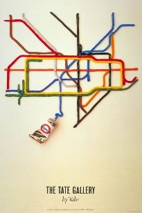
The London Underground map has become one of Britain’s top 10 design icons. It was not always this way. When Harry Beck, an employee of what was colloquially known as, ‘the Tube’ designed the map in 1931, there was great scepticism of his design. Harry was paid just 10 guineas for his work. A mere 500 pamphlets produced for the general public in the first instance, followed by huge demand. The rest, they say, is history.
The purpose of the map was to show connections and fare zones; lines ran only vertically, horizontally or at 45 ͦ diagonals. It had been compared to a circuit diagram. The creation used for other underground maps across the world (Harry Beck was involved in the design of the Paris Metro).

Harry’s 1960 map is most similar to the one we have today; the interchange symbol, now a circle, some lines changed their Pantone colours, additional ones were added but always maintaining the status of the river Thames (the 2009 version removed the river but public support secured a fast return).
Ideas for Further Exploration in the Classroom
So, what to do with the map? Obviously, there is the ‘I want to go from station x to station y, how many ways can I do it? What is the shortest/longest route? How much will it cost?
The TfL website now has a marvellous ‘Top Gear-esque’ feature of allowing you to plot your journey see all the available transport options (including walking) for you to make a decision on which mode would be best.
However, here’s a few others I’ve used before that you might like to try:
- Based on the average train speed (33km per hour), without stopping, how long would it take to travel from end-to-end?
- Exploring the stations with steps; most/least and comparing stations.
- I love the children’s book ‘London ABC’ Illustrated by Ben Hawkes.

I’ve used this to imagine we go through part/whole of the alphabet to find out how much this London discovery would cost and the underground routes you would take. For anyone that is familiar with the book, you will be aware of what each letter represents:

Those highlighted in yellow have set dates or simply may not be achievable on your visit!
There have been many interesting, alternative London Underground maps that have been produced over the years with great mathematical value. Here are a few of my favourites:

- Fitness – What do the numbers above represent? Walking steps to stations. Created in response to the pedometer craze, London Underground offered an alternative for those wanting to exchange all/part of their journey for a stroll. Further conversion work could be considered; how many steps = mile? Which routes are equivalent to a mile? Added to this, not an exact science, but the calorie-burn from all this walking: https://media.timeout.com/images/102785052/image.jpg

- Continuing with walking, TfL created a map to show how long it takes to walk between stations. Some excellent time investigations could result from this map: http://content.tfl.gov.uk/walking-tube-map.pdf

- This wonderful animation shows the reality of the London locations merged into a map of Harry’s creation – https://gfycat.com/athletictotalhuman
- Temperature on the London Underground – Data taken from one day in summer 2013:

- The average cost per month of renting in London (ideal for money investigations and the harsh reality of London living!). The map was created by ‘Thrillist’ in 2015 (so expect some further increases to monthly costs):

https://www.thrillist.com/lifestyle/london/london-underground-rent-map

- Finally, here’s an interesting map, proving that despite the term ‘underground’, it’s worth exploring how much of it is actually below ground.
Ideal for fractions and percentages estimation and investigation.

Additional sources of information
- https://tfl.gov.uk/info-for/schools-and-young-people/safety-and-citizenship/lesson-plans – TFL Teacher Resources
- https://tfl.gov.uk/tube-dlr-overground/status/?cid=pp028https://tfl.gov.uk/tube-dlr-overground/status/?cid=pp028 – Live Status allows comparison between modes of transport for the fastest journey to and from stations.
- https://plus.maths.org/content/happy-birthday-london-underground – Interesting facts about the London Underground
- https://tfl.gov.uk/fares-and-payments/ – The latest London Underground fares
- http://primaryfacts.com/2522/london-underground-facts/ – London Underground Facts
Here’s a GoogleDrive of useful resources too: https://drive.google.com/drive/folders/1teLQPCp37EKKYIT9tlIH79RhKEV4_XOy?usp=sharing
